
Web Components Introduction
Introduction to Web Components in HOOPS Visualize Web
HOOPS Visualize Web provides a modern, flexible user interface framework built on Web Components, enabling developers to create powerful, customizable 3D web applications with ease.
Web Components are a set of standardized browser technologies that allow you to define reusable, encapsulated HTML elements. By leveraging this approach, HOOPS delivers a UI system that is modular, framework-agnostic, and easy to extend, making it suitable for everything from quick prototypes to fully customized enterprise applications.
Why Web Components?
The Web Components architecture introduces a new level of flexibility to the HOOPS ecosystem. Instead of relying on a fixed UI, developers can assemble applications from independent building blocks—each responsible for a specific piece of functionality.
This approach provides several key benefits:
- Modularity – Components are self-contained and reusable across projects
- Customizability – Easily adapt or replace parts of the UI to fit your needs
- Scalability – Build simple viewers or complex applications using the same foundation
- Framework flexibility – Works with or without frameworks like React
Whether you’re exploring HOOPS for the first time or integrating it into an existing system, Web Components give you full control over how your interface looks and behaves.
What’s Included
The Web Components ecosystem in HOOPS Visualize Web is built around three main elements:
- A Demo Application – A fully functional viewer showcasing how components work together in a real-world UI
- A Web Components Library – A rich set of ready-to-use elements for interacting with 3D models and viewer features
- A UI Kit – A collection of foundational interface elements (layouts, buttons, panels, etc.) for building consistent user experiences
Together, these pieces provide both a starting point and a toolkit, allowing you to use prebuilt functionality out of the box or design a completely custom interface.
Designed for Developers
Each component is exposed as a standard HTML element, making it easy to integrate into any web application. Components communicate through a shared service layer and browser events, enabling clean separation of concerns and predictable behavior across your UI.
You can use components as-is, customize them, or deeply integrate them into your own architecture, depending on your project requirements.
For more information on Web Components, please refer to the Mozilla documentation here.
Our Web Components reference page can be found here.
Demo App
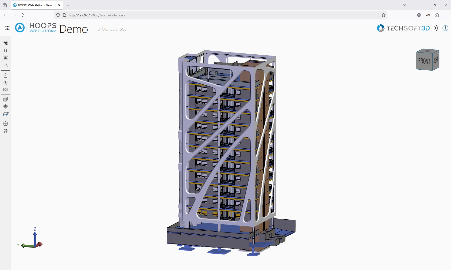
The user interface based on Web Components is demonstrated in our Web Viewer demo app, providing a practical example of how the new components can be utilized. The Web Viewer is built using React but can be easily modified to accept various frameworks. It reproduces the features of the previous UI with additional features such as a layout, a top menu with new interactivity, new dropdown menus, custom buttons, and icons.
Web Viewer with example model:
Requirements:
The Demo app is using import maps. Import maps are supported in the following browser versions and above:
| Browser | Minimum supported version |
|---|---|
| Chrome | 89 |
| Edge | 89 |
| Firefox | 108 |
| Opera | 76 |
Each of the components listed below is available as an HTML element. More information can be found in our API reference.
Viewer Components and Utilities
- <hoops-cad-configuration-list>: Displays the CAD Configuration list. Can be bound to the Viewer for selection events and visibility management, enhancing interaction with the model configurations.
- <hoops-context-menu>: Provides a customizable context menu that can be triggered on right-click within the viewer. It supports actions like isolate, hide, and show properties.
- <hoops-cutting-plane-panel>: Hosts controls for managing cutting planes, allowing users to create, edit, and delete cutting planes within the viewer.
- <hoops-ifc-relationship>: Displays IFC-specific relationships between elements, such as spatial or property set associations. Useful for navigating and understanding BIM data structures.
- <hoops-info-button>: A simple button to toggle an information panel, logic needs to be implemented at application level.
- <hoops-layer-tree>: Displays the layers from the assembly tree with associated nodes. Can be bound to the Viewer for selection events and visibility management, allowing for detailed layer control.
- <hoops-model-tree>: Displays the assembly tree structure. Can be bound to the Viewer for selection events and visibility management, enhancing interaction with the model hierarchy.
- <hoops-service-registry>: Manages service instances and their lifecycles within the viewer. It is necessary for establishing links between components and the Viewer.
- <hoops-settings-panel>: Manages viewer settings across three areas — Graphics (rendering), Controls (navigation, selection), and Interface (UI preferences).
- <hoops-toolbar-cad-configuration>: A simple button to toggle a cad configuration panel, logic needs to be implemented at application level.
- <hoops-toolbar-camera>: A standalone dropdown to control the camera view (projection and builtin views).
- <hoops-toolbar-camera-operator>: A standalone dropdown to enable different camera operators.
- <hoops-toolbar-drawmode>: A standalone dropdown to change the draw mode of the viewer.
- <hoops-toolbar-explode>: A standalone dropdown with a slider to control the explode factor.
- <hoops-toolbar-home>: A simple button that will reset the viewer to its initial state on click.
- <hoops-toolbar-layers>: A simple button to toggle the layers view, logic needs to be implemented at application level.
- <hoops-toolbar-model-tree>: A simple button to toggle the model tree, logic needs to be implemented at application level.
- <hoops-toolbar-properties>: A simple button to show the properties panel, logic needs to be implemented at application level.
- <hoops-toolbar-redlines>: A simple button to toggle a redlines panel, logic needs to be implemented at application level.
- <hoops-toolbar-settings>: A simple button to toggle a settings panel, logic needs to be implemented at application level.
- <hoops-toolbar-sheets>: A simple button to toggle the sheets panel, logic needs to be implemented at application level.
- <hoops-toolbar-snapshot>: A simple button to trigger a snapshot, logic needs to be implemented at application level.
- <hoops-toolbar-tools>: A simple button to toggle a tools panel, logic needs to be implemented at application level.
- <hoops-toolbar-types>: A simple button to toggle a generic types panel, logic needs to be implemented at application level.
- <hoops-toolbar-views>: A simple button to toggle the views panel, logic needs to be implemented at application level.
- <hoops-tools-markup-group>: Markup section of the tools panel.
- <hoops-tools-measurement-group>: Measurement section of the tools panel.
- <hoops-tools-panel>: Hosts measurement tools, redline markup, and selection modes for model interaction.
- <hoops-tools-redline-group>: Redline markup section of the tools panel.
- <hoops-tools-select-group>: Selection section of the tools panel.
- <hoops-sheet-list>: Displays the drawing sheets as a flat list. Can be bound to the Viewer for selection events, facilitating sheet navigation.
- <hoops-types-tree>: Displays a categorized list of types present in the model. Can be bound to the Viewer for filtering, selection, and visibility control based on object types.
- <hoops-view-tree>: Displays the views from the assembly tree with associated nodes. Can be bound to the Viewer for selection events and visibility management, facilitating view management.
- <hoops-web-viewer>: Encapsulated HoopsWebViewer object within an HTML tag. It provides a seamless way to integrate the Viewer into your web application.
- <hoops-web-viewer-context-manager>: A state manager for shared behavior between components. It is necessary for managing the state of toolbar buttons and other shared functionalities.
Services and Context Manager
The web-viewer-components library provides several services that are initialized and registered within the <hoops-service-registry> component.
These services allow you to interact with various aspects of the viewer and its functionality.
They use the built-in HTML event system to communicate changes and actions, allowing HTML components that use them to react and update their internal states accordingly.
Services can be accessed using various helper functions provided in the library:
- tryGetService<T extends IService>(serviceName: ServiceName): T | undefined: Attempts to retrieve a service by its name. Returns the service instance if found, or undefined if not found.
- getService<T extends IService>(serviceName: ServiceName): T: Retrieves a service by its name. Throws an error if the service is not found.
- getAllServices(): ServiceRegistry: Retrieves all registered services.
Built-in services are provided for common interactions with the viewer:
- CameraService: ICameraService
- CuttingService: ICuttingService
- ExplodeService: IExplodeService
- FloorplanService: IFloorplanService
- IFCRelationshipsService: IIFCRelationshipsService
- MeasurementService: IMeasurementService
- NoteTextService: INoteTextService
- PmiService: IPmiService
- RedlineService: IRedlineService
- RenderOptionsService: IRenderOptionsService
- SelectionService: ISelectionService
- SheetService: ISheetService
- SpaceMouseService: ISpaceMouseService
- ViewService: IViewService
- WalkOperatorService: IWalkOperatorService
It’s also possible to create and manage services by implementing the IService interface and registering them using the following helper functions:
- registerService(service: IService): void: Registers a custom service instance.
- unregisterService(serviceName: ServiceName): void: Unregisters a custom service instance.
- clearServices(): void: Clears all registered services.
If a service can be reset to its default state, it should implement the IResettableConfigurationService interface, which includes the following method:
`typescript
resetConfiguration(obj?: object): Promise<void>;
`
The obj parameter allows passing an optional configuration object to customize the default values to reset to.
UI Kit
A modest yet essential UI kit has been created to support the development of the Web Components library and the demo app. This kit includes the necessary elements to ensure a cohesive and functional user interface. It provides simple UI widgets, as well as a layout with menus and panels for containers, and a tree generic enough for all components to use. More information can be found in our API reference.
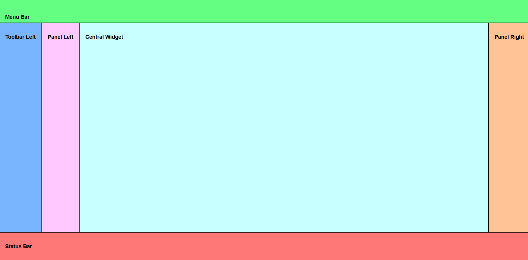
The HOOPS layout
UI Components and Utilities
- <hoops-accordion>: A custom web component that implements an accessible accordion using LitElement.
- <hoops-button>: A customizable button component that includes text. It can be used to trigger actions or navigate within your application.
- <hoops-color-button>: A button component that allows users to select a color. It provides an intuitive interface for color selection.
- <hoops-coordinate-input>: A custom web component that provides a coordinate input interface with both numeric input and range slider controls for editing coordinate values.
- <hoops-dropdown>: A dropdown menu component that allows users to select from a list of options. It enhances the interactivity and usability of your application.
- <hoops-icon>: A web component that stores and manages all the icons used in your application. It ensures consistency and easy access to icons.
- <hoops-icon-button>: A button component that includes an icon and text. It combines visual appeal with functionality, making it easy for users to understand its purpose.
- <hoops-layout>: A comprehensive layout manager featuring top, down, right, and left panels, toolbars, a menu bar, a status bar, and a central widget. It provides a structured and organized interface for your application.
- <hoops-list>: This class implements a list view as an HTML custom element. You can integrate it into your application using the hoops-list tag. It provides a structured way to display a list of items.
- <hoops-node-properties>: A panel designed to display properties in a key-value format. It is useful for showing detailed information about selected items in your application.
- <hoops-separator>: A separator component used in toolbars to visually divide groups of buttons or tools. It helps in organizing the toolbar layout.
- <hoops-switch>: An input widget that allows users to choose one of two values: on or off.
- <hoops-tabs>: A tab container component that manages multiple tab panels.
- <hoops-toolbar>: A basic vertical toolbar that allows you to stack buttons. It provides a convenient way to group and organize tools and actions.
- <hoops-tree>: This class implements a tree view as an HTML custom element. You can integrate it into your application using the hoops-tree tag. It is ideal for displaying hierarchical data.
CSS Variables
To ensure a consistent and customizable design, our library includes a set of CSS variables. These variables allow you to adjust the appearance of various components to match your application’s style or needs. The variables are defined in themes.css.
- hoops-accent-foreground: Color used for accent elements in the foreground.
- hoops-accent-foreground-active: Color for active accent elements in the foreground.
- hoops-accent-foreground-disabled: Color for disabled accent elements in the foreground.
- hoops-accent-foreground-hover: Color for accent elements in the foreground when hovered.
- hoops-background: Base background color for the application.
- hoops-dropdown-background-color: Background color for dropdown elements.
- hoops-dropdown-box-shadow: Box shadow for dropdown elements.
- hoops-dropdown-gap: Gap size for dropdown elements.
- hoops-dropdown-menu-border-color: Border color for dropdown menu elements.
- hoops-dropdown-menu-border-size: Border size for dropdown menu elements.
- hoops-dropdown-menu-border-style: Border style for dropdown menu elements.
- hoops-dropdown-menu-radius: Border radius for dropdown menu elements.
- hoops-dropdown-z-index: Z-index value for dropdown elements.
- hoops-foreground: Primary color for foreground elements.
- hoops-icon-height: Height of the icon container.
- hoops-icon-width: Width of the icon container.
- hoops-layout-height: Height of the layout component.
- hoops-layout-width: Width of the layout component.
- hoops-md-icon-button-content-size: Size of the content within medium icon buttons.
- hoops-md-icon-button-size: Overall size of medium icon buttons.
- hoops-neutral-background-20: Slightly darker neutral background color.
- hoops-neutral-background-50: Darker neutral background color.
- hoops-neutral-background-hover: Neutral background color when hovered.
- hoops-neutral-border: Neutral color for borders.
- hoops-neutral-foreground: Neutral color for foreground elements.
- hoops-neutral-foreground-active: Neutral color for active foreground elements.
- hoops-neutral-foreground-rest: Neutral color for resting foreground elements.
- hoops-node-properties-header-padding: Padding for table headers in node properties.
- hoops-node-properties-table-border: Border style for property tables in node properties.
- hoops-separator-color: Color used for separators.
- hoops-sm-icon-button-content-size: Size of the content within small icon buttons.
- hoops-sm-icon-button-size: Overall size of small icon buttons.
- hoops-svg-accent-color: Accent color used for SVG elements.
- hoops-svg-fill-color: Fill color used for SVG elements.
- hoops-svg-stroke-color: Stroke color used for SVG elements.
- hoops-tabs-active-indicator-color: Color of the active tab indicator line.
- hoops-tabs-active-indicator-height: Height/width of the active tab indicator.
- hoops-tabs-gap: Gap between tabs.
- hoops-tabs-header-background: Background color of the tab header area.
- hoops-tabs-header-border-color: Border color of the tab header.
- hoops-xl-icon-button-content-size: Size of the content within extra-large icon buttons.
- hoops-xl-icon-button-size: Overall size of extra-large icon buttons.
React Integration
While React is not required to use the Web Components, some React libraries are necessary if you are using that framework. To integrate our Web Components libraries into a React environment, HOOPS Visualize Web offers components that encapsulate UI Web Components. These components are available in the following dedicated libraries:
- @ts3d-hoops/web-viewer-components-react
- @ts3d-hoops/ui-kit-react
These libraries are essential for React integration and are utilized in our demo application.
Using Our Demo App
The demo app requires the following conditions:
Requirements:
- node.js 18.20.7 or newer
To launch the demo, in the folder /quick_start/beta-demo-app/:
npx http-server -c-1 . -o "/?viewer=scs&model=arboleda.scs"
All required dependencies will be downloaded and installed and a web page will be launched in your default web browser.
Development Environment
Important:
The packages are now available through npm registry! You can install them directly using npm. The local installation method from customer packages is still supported for existing workflows.
To get started developing, you can now choose between two installation methods:
Option A: Direct npm installation
- Run
npm install @ts3d-hoops/web-viewer-components
Option B: Local installation from customer package
- copy <INSTALL_DIR>/web_viewer/@ts3d-hoops to your /dependencies folder from your application project
- Run
npm install ./dependencies/@ts3d-hoops/web-viewer-componentsfrom a command prompt in your project directory
In /web_viewer/@ts3d-hoops/beta-demo-app-src, following commands to manage the project:
Important:
yarn usage is temporary, npm will be the final tool.
yarn install
yarn dev