The Plotting Classes
Overview
While Hoops is not primarily a mathematical plotting interface, the HGraph classes do provide the basic functionality to create a variety of useful plots and charts. The HPieChart class is responsible for creating and labelling pie charts. More complex 2D plots – including scatter plots, line charts, and bar charts - are handled by the HPlot2D class. Both classes offer a range of features such as inserting labels, creating a plot legend, adding a plot title, and many other customization options.
Pie Charts
Perhaps the simplest type of chart to create is the pie chart. As with all the HGraph classes, we must pass a valid segment key into the constructor of the HPieChart class. It then creates some or all of the following segment structure, as needed.
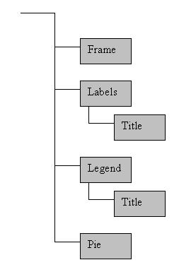
Once you have an instance of the HPieChart, it can be used to add data to the pie chart with the AddPieSlice function. When data is added to the pie chart, an anonymous slice segment is created beneath the pie segment in the tree and an ID for the slice is returned to the user. The segment contains the slice geometry and all information pertinent to that particular slice. The slice ID allows you to modify or remove that particular slice with other HPieChart functions. Colors of the pie chart are established by a colormap in the segment passed into the constructor.
Let’s look at an example of pie chart creation:
HPieChart *pie;
HC_KEY pie_segment;
double slices[6];
int slice_id[6];
//First we get a segment key to pass into the pie chart
HC_Open_Segment_By_Key(m_pView->GetModelKey());
pie_segment=HC_KCreate_Segment("Pie_Chart");
HC_Close_Segment();
//Then we create the pie chart
pie=new HPieChart(pie_segment);
//Next we add some arbitrary data
//The HPieChart will automatically resize the pie slices as data is added or removed
slices[0]=20.;
slices[1]=31.;
slices[2]=25.;
slices[3]=16.;
slices[4]=32.;
slices[5]=21.;
for(int i=0; i<6; ++i)
{
slice_id[i]=pie->AddPieSlice(slices[i]);
}
//Then we add some labels to the pie slices
pie->AddPieSliceLabel(slice_id[0], "Widgets");
pie->AddPieSliceLabel(slice_id[1], "Sprockets");
pie->AddPieSliceLabel(slice_id[2], "Cogs");
pie->AddPieSliceLabel(slice_id[3], "Gizmos");
pie->AddPieSliceLabel(slice_id[4], "Doohickeys");
pie->AddPieSliceLabel(slice_id[5], "Thingamajigs");
//Finally, we set the title, and colors for the pie chart
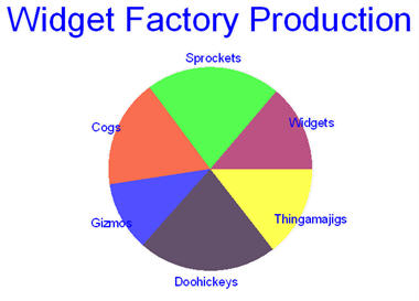
pie->SetPlotTitle("Widget Factory Production");
pie->SetPieColorMap("maroon, green, orange, blue, purple, yellow");
HC_Update_Display();
pie->PreserveData();
delete pie;
The above code will create a pie chart that looks like this.
You’ve probably wondered what the call to PreserveData at the end is for. Because all the data pertaining to the chart is stored in the segment tree, it could be difficult to remove once a pointer to the pie chart is gone. In order to prevent wasted memory and general clutter in your segment tree, when a plot is destroyed it cleans up its segment by default as well. But sometimes you want to keep the chart around for longer, in which case you must tell your chart to PreserveData. It then becomes incumbent upon you to manage the chart segment.
Other 2D Plots
In many cases, a pie chart will not be suitable for your data. In these cases, you should use HPlot2D which supports scatter plots, line charts, and bar charts. As with a pie chart, you must pass the key of a valid segment into the constructor, but you may also pass an HGraphPlotType to indicate a preference for one of the supported plot types. The default is PlotTypeScatter, but no matter what the plot type is you can force a data set to be interpreted as any of the supported types - the plot type merely establishes the default behavior.
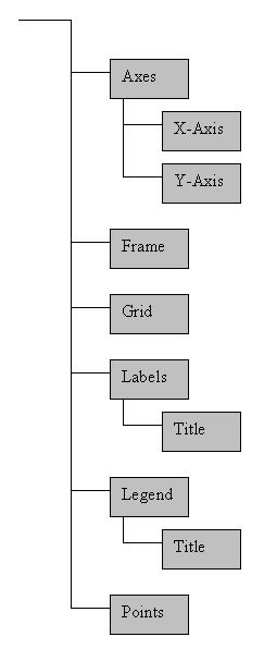
To add data to a 2D plot, you use the AddDataSet function (similar to the AddPieSlice function in HPieChart). It accepts an array of data points that can be in Cartesian, polar radians, or polar degrees format. All points in a single data set will share the same attributes. Thus, for example, if you want some data points to appear in blue while others appear in red you will need to separate them into two data sets. Each data set is housed in its own anonymous subsegment of the points segment. A sample plot segment structure appears below.
Depending on the plot type you selected, you will see different behavior when you view your plot. If you are using PlotTypeScatter, the data will be interpreted a locations for markers. Marker visibility will be on and neither lines nor bars will be drawn. If you are using PlotTypeLine, the markers will still be inserted, but marker visibility will default to off. In addition, a polyline will be drawn between the points, in the order they were provided. If you are using the PlotTypeBar, markers will again be inserted into the data segment with visibility off. Also, a rectangular mesh will be inserted into an anonymous subsegment of the data set’s segment. One edge of the mesh is at the data point, the opposite edge is at the x-axis, the width of the bar is divided evenly on either side of the data point. The color of the bars are taken from a color map, exactly like the pie chart. Of course, all these defaults can be overridden if desired.
The 2D plots also have a number of other customization options. You can overlay a polar or rectangular grid on your plot with an arbitrary mesh size in either axis direction. You can toggle axis visibility on or off for either axis independently as well as the tick size and frequency alongan axis. Colors, line styles, and fonts can all be set for axes, data sets, labels, legends, the plot frame, and the plot title.
What follows is an example of how to add several types of data to a single plot:
HPlot2D *plot;
HC_KEY plot_segment;
HPoint data[20];
HPoint more_data[100];
HPoint bar_data[6], bar_colors[5];
int which, i;
double x;

//get the plot segment key
HC_Open_Segment_By_Key(m_pHView->GetModelKey());
plot_segment=HC_KCreate_Segment("Graph01");
HC_Close_Segment();

//create the plot
plot=new HPlot2D(plot_segment);


//add a plot title and frame
plot->SetPlotTitle("This is a Plot Title");
plot->SetFrameVisibility(true);
plot->SetFramePattern("---");
plot->SetFrameWeight(2.f);
plot->SetFrameColor("red");

//adjust the axes and insert a grid
plot->SetAxisGridFrequency(X_Axis, 0.5);
plot->SetGridType(GridTypeRectangular);
plot->SetAxisRange(X_Axis, -7., 7);
plot->SetAxisGridRange(X_Axis, -7., 7);
plot->SetAxisTickFrequency(Y_Axis, 0.5);
plot->SetAxisRange(Y_Axis, -3., 5.);
plot->SetAxisGridRange(Y_Axis, -3., 5.);


//get some data points for y=x^2
x=-2.;
for(i=0; i<20; ++i)
{
        data[i].x=x;
        data[i].y=pow(x, 2);
        data[i].z=0.;

        x+=4./20.;
}

//add the data points to the plot and set some attributes
which=plot->AddDataSet(20, data);
plot->SetPointColor(which, "red");
plot->SetPointSymbol(which, "@");
plot->SetPointSize(which, 0.25);

//get some data points for y=sin(x)/x
x=-2*_PI;
for(i=0; i<100; ++i)
{
        more_data[i].x=x;
        more_data[i].y=(x!=0 ? sin(x)/x : 1);
        more_data[i].z=0.;

        x+=_PI/25;
}

//add the data to the plot and set it as a line
which=plot->AddDataSet(100, more_data);
plot->SetLineVisibility(which, true);
plot->SetPointVisibility(which, false);
plot->SetLineColor(which, "green");

//get some bar data and colors
bar_data[0].Set(1.,3.,0.);
bar_data[1].Set(2.,.5,0.);
bar_data[2].Set(3.,-2.,0.);
bar_data[3].Set(4.,3.5,0.);
bar_data[4].Set(5.,2.5,0.);
bar_data[5].Set(6.,1.25,0.);

bar_colors[0].Set(1., 0., 0.);
bar_colors[1].Set(0.5, 0., 0.5);
bar_colors[2].Set(0., 1., 0.);
bar_colors[3].Set(0., 0.5, 0.5);
bar_colors[4].Set(0., 0., 1.);


//add the data to the plot and set it as a bar chart
which=plot->AddDataSet(6, bar_data);
plot->SetBarVisibility(which, true);
plot->SetPointVisibility(which, false);
plot->SetBarColorMapByValue(which, 5, bar_colors);
plot->SetBarEdgeVisibility(which, true);

plot->PreserveData(true);
delete plot;

m_pHView->Update();
This code generates the following plot.
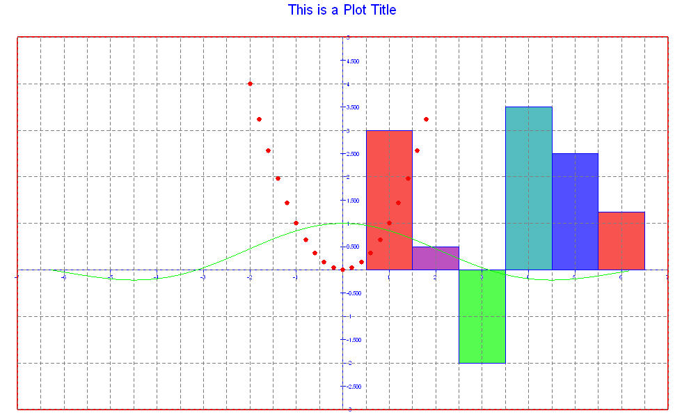
There are some things that deserve mentioning about this code. Notice that the grid frequency along each axis is independent of the other axis as well as the tick frequency on the same axis. Also notice how easy it is to change the plot type of any given data set. In all cases,the plot attributes match as closely as possible the 3dgs functions they emulate. For example, if you wanted more information about frame linestyles, the best place to look would be the documentation for HC_Set_Line_Style. The same is true for point symbols, colors, and text fonts.
Labels and the Legend
Very little has been said up to this point about the ability to add meaningful text to your plots. Both types of graphs (pie charts and 2D plots)can have labels inserted anywhere into the graph. They can also have a single legend which describes the data.
Labels can contain any text string, including Unicode, and can be oriented along any line desired. A legend associates colors with text strings and keeps them grouped together for easy reference. An example follows:
HPlot2D *plot;
HC_KEY plot_segment;
HPoint bar_data[3];
HPoint line_data[4];
int bar_id, line_id, label_id;
HC_Open_Segment_By_Key(m_pHView->GetModelKey());
plot_segment=HC_KOpen_Segment("Graph02");
HC_Close_Segment();
HC_Close_Segment();
plot=new HPlot2D(plot_segment, PlotTypeBar);
plot->SetAxisRange(X_Axis, 2003., 2008.);
plot->SetPlotOrigin(HPoint(2003., 0., 0.));
plot->SetAxisRange(Y_Axis, -1., 4);
plot->SetAxisVisibility(Y_Axis, false);
bar_data[0].Set(2004, 1., 0.);
bar_data[1].Set(2005, 1.5,0.);
bar_data[2].Set(2006, 2.25,0.);
bar_id=plot->AddDataSet(3, bar_data);
plot->SetBarColorMap(bar_id, "blue, green, lavender, orange, yellow");
line_data[0]=bar_data[0];
line_data[1]=bar_data[1];
line_data[2]=bar_data[2];
line_data[3].Set(2007, 3.375, 0.);
line_id=plot->AddDataSet(4, line_data);
plot->SetBarVisibility(line_id, false);
plot->SetLineVisibility(line_id, true);
plot->SetLineColor(line_id, "red");
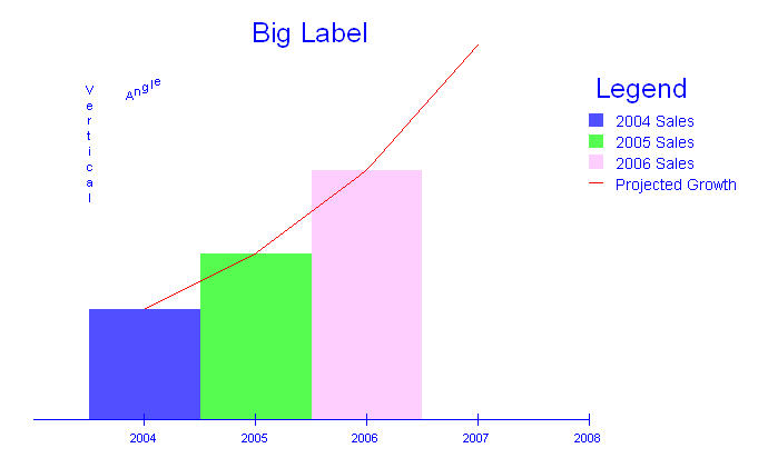
plot->AddLegend(HPoint(2008.,3.,0.));
plot->AddLegendEntry("2004 Sales", "blue", LegendEntryTypeBox);
plot->AddLegendEntry("2005 Sales", "green", LegendEntryTypeBox);
plot->AddLegendEntry("2006 Sales", "lavender", LegendEntryTypeBox);
plot->AddLegendEntry("Projected Growth", "red", LegendEntryTypeLine);
plot->AddLabel("Angle", HPoint(2004., 3., 0.), PointFormatCartesian, 1., .5, 0.);
plot->AddLabel("Vertical", HPoint(2003.5, 2.5, 0.), PointFormatCartesian, 0., -1., 0.);
label_id=plot->AddLabel("Big Label", HPoint(2005.5, 3.5, 0.), PointFormatCartesian);
plot->SetLabelTextFont(label_id, "size=0.2 oru");
HC_Update_Display();
plot->PreserveData(true);
delete plot;
The above code will generate a plot that looks like the following: