Grids
HOOPS Visualize Desktop supports the use of grids. Grids are often used as reference points, reference lines, or as guides for placing objects. Grids are planar, and cells can be square, rectangular, angled (parallelogram), or radial.
Grids are implemented as a collection of faces with edges and vertices. As such, the grid’s edge attributes are controlled by the HPS::EdgeAttributeControl, and the vertex attributes are controlled by the HPS::MarkerAttributeControl. Attributes for a grid apply to the grid as a whole - you cannot set attributes on subparts.
One advantage of grids is that they can be infinite in extent. So, if you are using a grid as a background, you do not have to worry about how large to make the grid. HOOPS Visualize Desktop computes which parts of the grid are visible, and draws only those parts.
    HPS::GridKit gridKit;
    gridKit.SetFirstCount(10);
    gridKit.SetSecondCount(10);
    gridKit.SetFirstPoint(Point(0.3f, 0, 0));
    gridKit.SetSecondPoint(Point(0, 0.1f, 0));
    gridKit.SetOrigin(Point(0, 0, 0));
    gridKit.SetType(HPS::Grid::Type::Quadrilateral);

    mySegmentKey.InsertGrid(gridKit);
HPS.GridKit gridKit = new HPS.GridKit();
gridKit.SetFirstCount(10);
gridKit.SetSecondCount(10);
gridKit.SetFirstPoint(new Point(0.3f, 0, 0));
gridKit.SetSecondPoint(new Point(0, 0.1f, 0));
gridKit.SetOrigin(new Point(0, 0, 0));
gridKit.SetType(HPS.Grid.Type.Quadrilateral);

mySegmentKey.InsertGrid(gridKit);
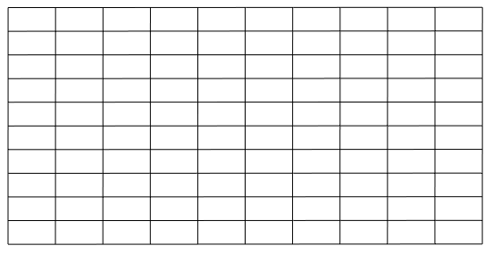
The grid produced by the above code
The calls to SetFirstPoint and SetSecondPoint represent a vector from the origin to which the point is drawn for each axis of the grid. The point is then repeated at regular intervals. By specifying two vectors that are not perpendicular, you can create non-traditional shapes for grid cells.
If you specify zero for the grid counts, the grid will extend infinitely. When viewed in perspective, infinite grids are drawn to infinity, smoothly vanishing toward the horizon.
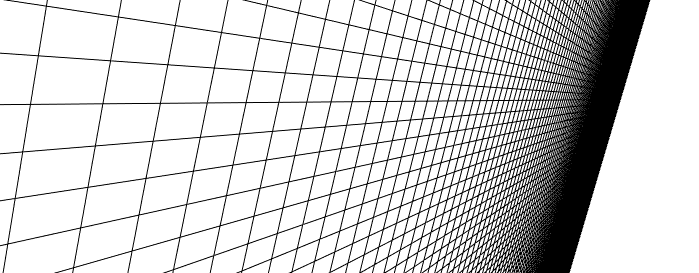
A grid with zero for the grid counts extends to the horizon
Radial Grids
Radial grids follow the same rules as quadrilateral grids. The only difference is that you would specify the HPS::Grid::Type::Radial enum when setting up the grid.
gridKit.SetType(HPS::Grid::Type::Radial);
gridKit.SetType(HPS.Grid.Type.Radial);
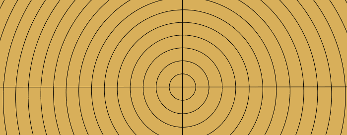
A radial grid
Customizing the Appearance
The appearance of the grid lines can be customized to fit your needs. In this example, a custom line pattern and face color are applied to the grid. See our section on portfolios for more details on applying materials to lines and faces.
    // create a LinePatternKit
    HPS::LinePatternKit myLPK = HPS::LinePatternKit::GetDefault(HPS::LinePattern::Default::Dashed);
    myLPK.SetJoin(HPS::LinePattern::Join::Bevel); // control how lines join at intersections
    myPortfolio.DefineLinePattern("myPattern", myLPK); // make sure the portfolio is accessible in your segment hierarchy
    mySegmentKey.GetLineAttributeControl().SetPattern("myPattern");

    // set the weight and pattern of the grid
    mySegmentKey.GetEdgeAttributeControl().SetPattern("myPattern").SetWeight(2.0f, Edge::SizeUnits::Pixels);
    mySegmentKey.GetMaterialMappingControl().SetEdgeColor(HPS::RGBAColor(0.8f, 0.8f, 0.8f)); // set the grid color
    mySegmentKey.GetMaterialMappingControl().SetLineColor(HPS::RGBAColor(0.0f, 0.0f, 0.0f));
    mySegmentKey.GetVisibilityControl().SetEdges(true); // enable the visibility of edges
    mySegmentKey.GetMaterialMappingControl().SetFaceColor(HPS::RGBAColor(0.4f, 0.7f, 0.2f)); // set the background grid color
// create a LinePatternKit
HPS.LinePatternKit myLPK = HPS.LinePatternKit.GetDefault(HPS.LinePattern.Default.Dashed);
myLPK.SetJoin(HPS.LinePattern.Join.Bevel); // control how lines join at intersections
myPortfolio.DefineLinePattern("myPattern", myLPK); // make sure the portfolio is accessible in your segment hierarchy
mySegmentKey.GetLineAttributeControl().SetPattern("myPattern");

// set the weight and pattern of the grid
mySegmentKey.GetEdgeAttributeControl().SetPattern("myPattern").SetWeight(2.0f, Edge.SizeUnits.Pixels);
mySegmentKey.GetMaterialMappingControl().SetEdgeColor(new HPS.RGBAColor(0.8f, 0.8f, 0.8f)); // set the grid color
mySegmentKey.GetMaterialMappingControl().SetLineColor(new HPS.RGBAColor(0.0f, 0.0f, 0.0f));
mySegmentKey.GetVisibilityControl().SetEdges(true); // enable the visibility of edges
mySegmentKey.GetMaterialMappingControl().SetFaceColor(new HPS.RGBAColor(0.4f, 0.7f, 0.2f)); // set the background grid color
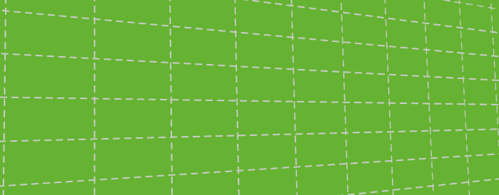
A grid configured with a line pattern and color