Rendering Photo-Realistic Images
The whole point is: how can we use HOOPS Luminate to generate a photo-realistic image? How can we reach an astonishing level of realism? How do we reach the quality of the example below using HOOPS Luminate in the context of your application? This book will try to provide you hints, tips, and evolution tracks to follow to move forward in this direction.
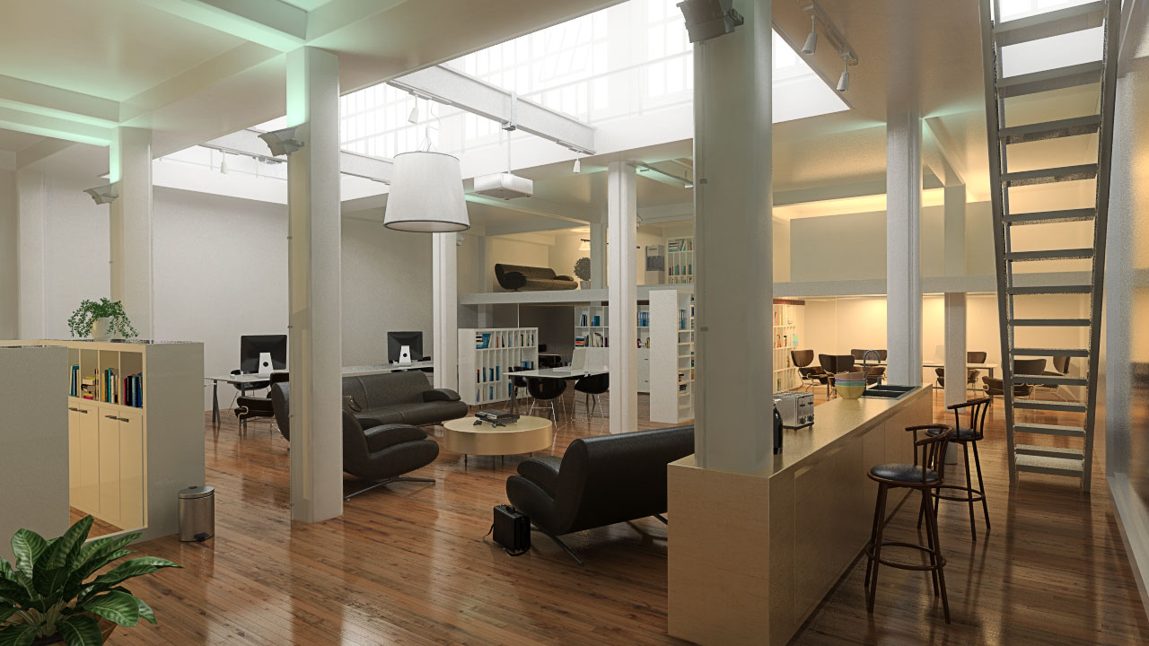
An indoor scene example with a quite high level of realism.
Above, we have the goal. Below, we have the real startup point of many CAD or design applications that haven’t worked on their graphics for 10 years or more, or that are using very old rendering technologies that haven’t evolved. We’ll start from a the same scene, as it can be produced by applications that naturally focus on their own business first, which can be about manufacturing, construction or whatever else, but not rendering. So we get the kind of image which is shown below:
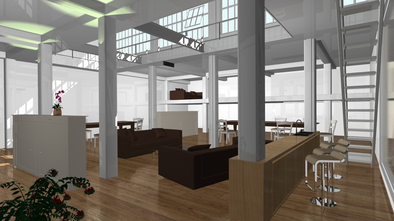
The startup image of our scene. Yes, compared to the first one, visually, it hurts ;-)
So, we can see that we need a complete ‘home staging’ training session to turn our initial image into the final one. This book is about all the stages we’ll need to get through to raise our image quality level.
Playing the 7 Mistakes Game
Let’s compare our original image and the image we want to produce. We can classify all the differences and tackle them down one after the other. Some will be easy to fix, others will imply development and changes into your product. Ok, there may be more than 7 errors to catch-up here :-)
Remove All Non Physical Lights
Our startup image is desperately flat. It has no contrast. Objects seem to float in the air. This is mostly due to the lighting that is present in the scene. In this scene, we have voluntarily added most bad best practices in the setup:
- There’s an ambient light.
- There are point lights dispatched in the model (3 indeed) whose goal are to “relit” the scene a little bit, to make it less flat. These were added because using the ambient light produces a really too flat result.
Our very first move will be to remove all these lights. ALL OF THEM. Ok, we’re here now:
Remove all non physical lights.
Render with HOOPS Luminate!
If you read this page, you may be already familiar with the HOOPS Luminate rendering engine, but this may not be the case already. The second move we recommend is to switch to the HOOPS Luminate software ray-tracer to perform the rendering. This chapter link here: Setup the Rendering will detail all the HOOPS Luminate rendering options that should be set to configure the rendering properly. Below, we have added a physical sunlight and skylight, and enabled a HOOPS Luminate high quality rendering with global illumination turned on, HDR and tonemapping:
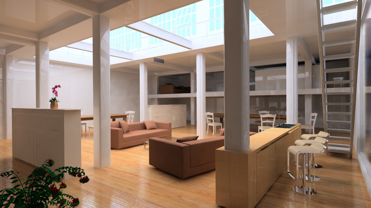
Now rendered with HOOPS Luminate and a physical sunlight and skylight only setup.
That’s better. We feel a real difference compared to our original image, that can be observed mostly in the global intensity range and contrast of the new image and in how objects seem to find their real positions “on the ground”:
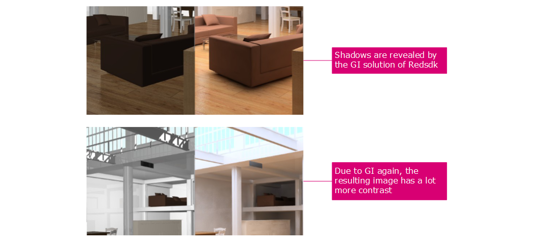
Illustration of lighting enhancements that result of HOOPS Luminate’s global illumination solution.
Add New Physical Lights
The next step will be to use physical lights and only these lights to add a lighting contribution to the scene. Using physical lights require a correct modeling, performed with real units and dimensions.
Please see all details here: Using Physical Lights.
The results is below once we have added a set of physically correct lights to the scene:
Physically correct lights added to the scene.
Remove All Poor Geometries
This step is quite subjective. Geometries that are not detailed enough won’t participate to the realism of the resulting image. Let’s look at the example below to illustrate this fact:
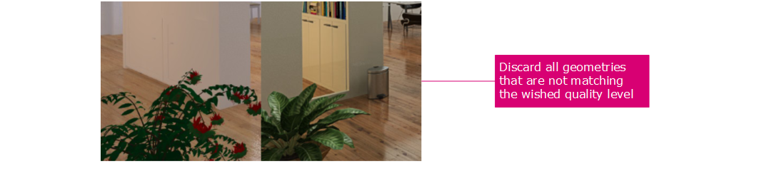
Remove all poorly defined geometries from the scene.
Even if it’s not a really bad geometry, the plant in the lower left image corner is a good example of bad looking geometry. You’ll never be able to make it look real. The leaves just don’t make it possible. Materials could be enhanced for sure, but the original modelling is not good enough. The comparison with the final image plant speaks by itself: modeling looks better, materials are better, so is the result.
Similarly, the cabinet behind the plant is ugly. It could be made look more realistic with a more detailed setup and separation of geometries, but this kind of extra geometry must be really eye catching and participate a lot to the realism of the scene simply because it’s visible in the image: it covers a non neglectable portion of the image. If the geometry is in front of the scene, the need for realism is even greater.
Use High Quality Textures and Materials
Ok, after the cleanup of the previous step, we’re about to setup another key element in realism: materials. A good material must use high quality textures that define a number of properties (diffusion, bump, reflectance); it must be equilibrated in energy and it must support a number of specifications such as Fresnel or be able to render glossy effects.
All details on material setup can be found there: Setup Materials.
Upgrading all materials after removal of poor geometries.
In our example scene, the most important material is the wood floor; The original texture was about 800 x 800 pixels and that’s just not enough. A HD image is 1920 x 1080 pixels. So a floor material may cover the entire image width or height. If it’s initial resolution is not at least twice the size of the image, then the quality will suffer. In the image above, our floor texture is 4000 x 4000, and it adds a lot of finer details in the image. We can see the difference in the close-up below:
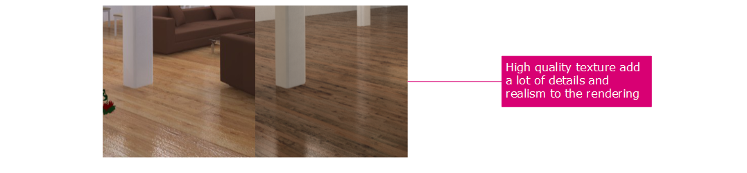
Upgraded materials and textures add finer details to the image.
Low quality textures will not provide a good feedback if a single image texel covers too many image pixels. Then, attention must be paid to the coherency of the material. A wood floor with wood planks that have a small interval should have a bump map and a reflection map to fully describe them. A common mistake is for instance to use the diffuse map as a bump map. A diffuse color map NEVER makes a good bump or displacement map. It represents the color of the surface and neither its relief nor its reflectance.
Never Let Lights Float in the Air!
Now we can redo the setup of the scene and add all the missing geometries that can make it look more real. The very first important missing geometries are lights. In many applications, there’s nothing done for the modelling of the light. This is a very important point to keep in mind: the bulb of the light must have a geometry in the scene, describing its shape and position, and the full lamp it’s in should be modelled. We have an illustration of that fact in our scene below:

Example of added realism thanks to a real light geometry setup.
Add Missing Eye Catching Geometries
Now we come to the point where we need to setup geometries to make the scene real. If you’re in an office, look around you and count the number of small objects that you see: keyboards, pencils, coffee mugs, papers, computer screens, chairs, tables, books, vegetals, etc…you can probably count hundreds of them in a single office room. Somehow, we need to replicate that to assemble a scenery that look real.
This is the point of that Setup Geometries chapter.

Eye catching geometries in our scene.
Break Similarities
One point in these eye catching geometries we have discussed in the previous paragraph is that they break all kind of similarities. They add different color tints in our image, and break all continuous lines in the picture. This is also an important point in the setup of the scenery. In our original image, the three bar stools are aligned in an unrealistic manner. Let’s compare the ‘before’ and the ‘after’:
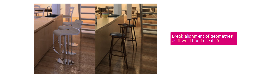
And example of bad alignment that should be replaced.
Turn on HDR and Tonemapping
The next chapter is on tonemapping and can be accessed right here: Tonemapping Explained.
A physically correct rendering must be performed using a full HDR rendering pipeline (see details in the doc Real-Time Rendering of 3D Datasets, under the section Choosing a Full HDR Rendering Pipeline), because all physical lights intensities are completely denormalized, and a simple color range of [0.0, 1.0] can’t provide a good restitution of the real intensities in the scene.
The tonemapping processes the image so that all it’s intensities are captured and scaled back to be in the visible range. Tonemapping can be used to focus on dark or bright areas at will, and can be used to modify a rendering - even after completion of the image.
…And you are done!
That’s it! We hope that this book could provide useful informations to you on how to setup a scene to get a better rendering quality. We’re programmers and we’re no artists, so we have tried to summarize all the experience and tricks that we could gather after years of using HOOPS Luminate and other rendering technologies to provide valuable informations to help our customers do better images.